Result visualisation and reporting tools (I)
Finding the right KPIs for a given business target, devising the appropriate visualisation and implementing the full reporting process is the basis of many analytics projects. The selection below are just a few illustrative examples.
Waterfalls
While almost a cliché of the consultant graph, waterfalls are useful when it comes to explaining how things add up, especially when negative contributions occur.
Visualise profit and loss statements, break down trends of performance metrics into their main contributors, etc
Top-Flop Tiles
All the angles and fine points have been discussed. Now the teams want guidance. Top-flop tiles condense the core recommendations for activities by segment in a single sheet:
- Promotion X for ? Good.
- Product range Y in the online channel? Don't! Etc.
Manhattan or Mosaic
It is all about understanding how your chicken get in the basket.
- How is revenue driven by prices and volume sales of products?
- How is profit driven by margins and revenues per segment?
- How is return on media driven by size and efficiency of the different channels?
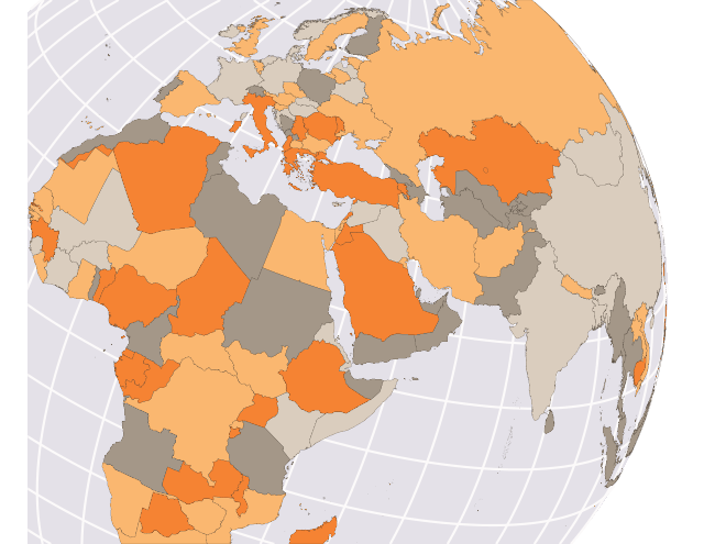
Maps
From plotting sales locations and catchment areas, over understanding regional differences in customer structure or competitive pressure, to strategic overviews over the region. Map graphics are a must have.